Blog

Joe's Food Blog

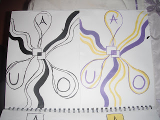
This is the first of my final concepts. I have done this out in both black and white and in color.
The idea behind this concept is:
The two squares in the center represent the college, DKIT, the center of the community.
The boxes coming from the two center boxes represent the "building blocks" of life, that the college give to people.


This is my the second of my final concept ideas, I also did this out in both black & white and in color.
The idea behind this concept is: Again, the two squares in the center represent the college, DKIT, the center of the community.
The lines coming from the two center squares represent the connections and opportunities the college gives to people.
They also represent the roads and paths that students take to and from the college and generally on their life journey.
The drop shapes (circles) represent the different cultures all attending the college for the same reason.


This logo has holding power and uniqueness. The use of the word upside is keeping a hold on your attention as you look repeatedly to see a few letters have been turned upside down but still spelling the word upside.

This logo is unique also and has holding power. As you look once it looks like binoculars. Then you read the words wine searcher and look at the image again and see the two half bottles of wine.


This logo doesnt work for me at all. The designer obviously tried to create holding power on the viewer but for me its too illegible. I got frustrated trying to figure out what the logo said.


I love this logo. So clever and unique. The shape of bananas but yet in the shape of the roles of film. Unique and the tone of voice gives a sense of this company being slick and professional.


Value and association comes into account with this logo. Instead of only having the writing on its own adding the clouds associates the contact with people over seas, and abroad.


The famous apple logo is simple and clever. This may be confused with description as when you see the logog you say apple and may think the company produces apples. This logo has value and like the nike logo just has that extra affect. Simple and sleek shows the correct tone of voice for this company.

I think this logo is well done, it is an american channel. This is again associated with new york as the sky rise buildings are in the image.


This logo has been changed from the mtv to the wtf, what used to be music television
has moved to entertainment television. The logo is clever because when you look at 'wtf'
the first statement that enters your mind is the 'what the f***' which is common slang word young people use these days. This assosiation attracts viewers. The real meaning is 'welcome
to fun'. This logo works for now but it may go 'out of fashion'.


This logo is obviously well known. The use of text is used cleverly is this logo.

The word flick ryhmes with the work click, which is an assosiation with taking

photogrpahs(photography). The ‘r’ on its own adds uniqueness by going against the rules

of the english language of having an ‘e’ in the word. It also gives it value as it add the visual

element.

This logo captured my attention imediately, mainly I think because of the colors and the 3d affect. Then the holding power of the logo kicked in as I read the “electronic entertainment expo”.

I then began to look more closely to see if the red 3 was actually an E but it’s not.

This logo is for a gaming day event called ‘E3’. I think this a cleverly executed logo as the 3d

affect captures your attention as has the assosiation with the 3d side of new gaming.


10thdimension Logo design: Very cool logos from Los Logos 4

Here are some logo design tips that I’ve learned in my time being a designer (Derek Kimbell)

1. Don’t worry about adding colors to your logo until after the design has been established.

2. Keep your design balanced.

3. Understand the meaning behind colors. You can read more about this in my post on Color Psychology.

4. Stay away from logos that are too wide or too tall. Try to keep the design compact.

5. A font choice can make or break a design. Chose one that fits the company you’re designing for. Also make sure the font goes well with the rest of the design.

6. Sketch out your ideas before you even touch a computer.

7. Your logo’s outline should be distinct.

8. Any logo should look good in black and white.

9. Don’t use lines or strokes that are really thin.

10. Avoid using too many colors. There are exceptions to every rule, but try to limit your color choices to 3 or less.

11. Research the company you are designing for, as well as it’s industry and competition.

12. Be unique and original rather than following the obvious or cliche route.

13. Avoid using too much detail or creating designs that are overly complex.

14. The logo needs to be distinguishable when viewed or printed at smaller sizes.

15. Create a design that communicates well.

16. Stay away from neon or extremely bright colors when ever possible.

17. Avoid the cliche/overused marks and symbols such as the “swoosh”.

18. Logos based around type should not include more than 2 fonts.

19. Create in vector format only.

20. Not every logo needs a mark (symbol).

21. If your design includes both a mark (symbol) and text, then make sure they compliment each other well.

22. Get your friends or family’s opinion on a logo before submitting it to a client.

23. Know the audience or target group you are creating the logo for.

24. Learn your software so it doesn’t hold you back.

25. Play around with shapes and typefaces if you are having trouble sketching out ideas.

26. A logo doesn’t always need to say what a company does.

27. Don’t design around trends. A logo should be timeless.

28. Chose fonts that are easily readable at large and smaller sizes.

29. Take advantage of the excellent online resources and books available on logo design.

30. A logo should be memorable.


The logo of the Office of Multicultural Affairs. It has a nice ethnic, simple look. Very colourful and pretty.

The typography works well and the design simple yet effective. Multicultural logos tend to have the same themes but then the subject matter is limited hence the lack of diversity and originality of ideas.

Multicultural Logo

Multicultural logo design in cmyk, utilising browns, yellow, orange, red and grey. Also features a small cup or trophy in the ‘i’ symbolising acheivement or competition or winning. In the background is the second word of the title faded behind like a watermark in grey. Suitable for a two word title or company name.

Luis Vuitton Logo

Louis Vuitton Mallettier, usually shortened to LV is a French leather goods and luxury fashion brand and company, one of the main divisions of LVMH, the world's largest luxury goods conglomerate. The Luis Vuitton logo was first introduced in 1896 and it has been synonymous with luxury ever since. The famous signature Monogram Canvas was created as a way to prevent counterfeiting. Ironically, the brand is known today as one of the most heavily counterfeited in fashion history, with just over 1% of the items in circulation considered authentic.The company's graphic symbols, such as flowers and quatrefoils (as well as the LV monogram), were based on the trend of using Oriental and Japanese designs in the mid-Nineteenth Century.In 2001, the new Art Director of Louis Vuitton, Marc Jacobs decided to invite nine designers, architects and artists to add their own visionary approach to the brand. Collaborations included Takashi Murakami's cherry blossom design and Stephen Sprouse's graffitied logo. The “Icons” exhibition unpacked itself at the dedicated gallery space in the Louis Vuitton flagship store in Paris. In today's world, Louis Vuitton brings up thoughts of the extravagant, posh lifestyle of the socialites and celebrities who carry bags and purses emblazoned with the Louis Vuitton logo design.


The famous fashion house of Gucci was founded in Florence, Italy in 1921. It is the biggest selling Italian brand in the world, operating 425 stores worldwide as well as selling designer items through franchises and department stores. It was not until around the 1960s that the famous GG Gucci logo came into being.


Although some claim that Coco Chanel created this logo herself in 1925, others dispute this and say the logo was created for her. One thing is for certain; this logo for The House of Chanel is striking, yet classy and timeless.
It is a simple black and white design with the double “C’s” that interlock one another back to back and boldly stand for the initials of Coco Chanel as well as this iconic brand name. Because it is strictly a letterform mark using the two sans serif “C’s”, the logo relates a brand message of class and simplicity. It emanates the elegance and understated strength and resilience of the female within a harsh world. The Chanel logo has helped propel the Parisian haute couture fashion house into a household name, enjoyed by the rich and famous and now sought out by the masses in the form of counterfeits.

Current Coca-Cola Image


Evolution of the Coca-Cola image

The Coca-Cola script was designed by an amateur, Frank Robinson, the fledgling company's bookkeeper. He devised both the Spencerian script and the brilliantly concise words beneath: "Delicious and Refreshing." The bottle is among the most recognizable icons in the world, a design that has come to symbolize the youthful exuberance of America. Countless variations have been released over the decades, but the enduring classic is the curved vessel designed by the Root Glass Company of Terre Haute, Indiana, and introduced in 1915.

Arguably one of the most famous name brands in the world, partly due to the intense marketing orchestrated by Coca-cola. The design is simple, there is no image incorporated into the design, the design is carried mainly on the basis of lettering


Original Playboy Logo


The origin of the famous 'playboy' rabbit head?
Designed by Art Paul, Playboy magazine's first art director, the rabbit head
has appeared on the cover of every issue of the magazine since the second.
hugh hefner, the creator of the 'playboy' magazine, once explained,
'I selected a rabbit as the symbol for the magazine
because of the humorous sexual connotation, and because he offered an
image that was frisky and playful. I put him in a tuxedo to add the idea of
sophistication. there was another editorial consideration, too.
since both 'the new yorker' and 'esquire' use men as their symbols,
I felt the rabbit would be distinctive; and the notion of a rabbit dressed up
in formal evening attire struck me as charming, amusing and right.'


Logo designs by Herb Lugalin.

Herbert F. (Herb) Lubalin (1918 – May 24, 1981) was a prominent American graphic designer. He collaborated with Ralph Ginzburg on three of Ginzburg's magazines: Eros, Fact, and Avant Garde, and was responsible for the creative visual beauty of these publications. He designed a typeface, ITC Avant Garde, for the last of these; this distinctive font could be described as a post-modern interpretation of art deco, and its influence can be seen in logos created in the 1990s and 2000s. Herb Lubalin became entranced by the possibilities presented by typography as a communicative implement. Gertrude Snyder notes that during this period Lubalin was particularly struck by the differences in interpretation one could impose by changing from one typeface to another, always “fascinated by the look and sound of words (as he) expanded their message with typographic impact."

The 'Mother' and 'Families' designs are iconic; they are also simple but clever (or clever in their simplicity). The 'beards' logo I don't like, but have included it as an example of tasteless design.

Next PostNewer Posts Previous PostOlder Posts Home