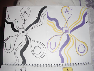
This is the first of my final concepts. I have done this out in both black and white and in color.
The idea behind this concept is:
The two squares in the center represent the college, DKIT, the center of the community.
The boxes coming from the two center boxes represent the "building blocks" of life, that the college give to people.

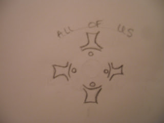
This is my the second of my final concept ideas, I also did this out in both black & white and in color.
The idea behind this concept is: Again, the two squares in the center represent the college, DKIT, the center of the community.
The lines coming from the two center squares represent the connections and opportunities the college gives to people.
They also represent the roads and paths that students take to and from the college and generally on their life journey.
The drop shapes (circles) represent the different cultures all attending the college for the same reason.
 This logo has holding power and uniqueness. The use of the word upside is keeping a hold on your attention as you look repeatedly to see a few letters have been turned upside down but still spelling the word upside.
 This logo is unique also and has holding power. As you look once it looks like binoculars. Then you read the words wine searcher and look at the image again and see the two half bottles of wine.
 I love this logo. So clever and unique. The shape of bananas but yet in the shape of the roles of film. Unique and the tone of voice gives a sense of this company being slick and professional.
 Value and association comes into account with this logo. Instead of only having the writing on its own adding the clouds associates the contact with people over seas, and abroad.
 The famous apple logo is simple and clever. This may be confused with description as when you see the logog you say apple and may think the company produces apples. This logo has value and like the nike logo just has that extra affect. Simple and sleek shows the correct tone of voice for this company.
 I think this logo is well done, it is an american channel. This is again associated with new york as the sky rise buildings are in the image.


This logo is obviously well known. The use of text is used cleverly is this logo.
The word flick ryhmes with the work click, which is an assosiation with taking
photogrpahs(photography). The ‘r’ on its own adds uniqueness by going against the rules
of the english language of having an ‘e’ in the word. It also gives it value as it add the visual
element.

This logo captured my attention imediately, mainly I think because of the colors and the 3d affect. Then the holding power of the logo kicked in as I read the “electronic entertainment expo”.
I then began to look more closely to see if the red 3 was actually an E but it’s not.
This logo is for a gaming day event called ‘E3’. I think this a cleverly executed logo as the 3d
affect captures your attention as has the assosiation with the 3d side of new gaming.


